Histogram Rendering with Minitab
What is Histogram Rendering with Minitab?

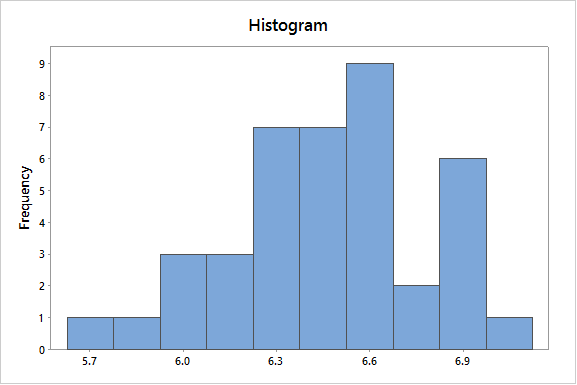
A histogram is a graphical tool for presenting the distribution of data. The X axis represents the possible values of the variable, and the Y axis represents the frequency of the value occurring.
This graphical summary consists of adjacent rectangles erected over intervals with heights equal to the frequency density of the interval. The total area of all the rectangles is the number of data values.
A histogram can also be normalized. In the case of normalization, the X axis still represents the possible values of the variable, but the Y axis represents the percentage of observations that fall into each interval on the X axis.
The total area of all the rectangles in a normalized histogram is 1. Using these graphical representations, we gain a better understanding of the shape, location, and spread of the data.
How to Perform Histogram Rendering with Minitab
Data File: “Histogram” tab in “Sample Data.xlsx”
Steps to render in Minitab:
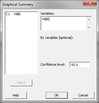
- Click Stat → Basic Statistics → Graphical Summary.
- A new window named “Graphical Summary” pops up.
- Select “HtBk” as the “Variables.”

- Click “OK.”
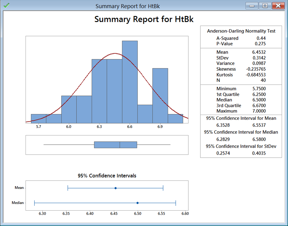
- The histogram appears in the new window.

Model summary: The output from the previous steps has generated a graphical summary report for the HtBk dataset. The information provided includes a histogram. The image shows the frequency distribution of the numerical categories from approximately 5.7 to 6.9. You can see that the shape of the data roughly follows the bell curve.
About Lean Sigma Corporation
Lean Sigma Corporation is an independent Six Sigma certification authority responsible for the development, administration, and governance of professional Six Sigma credentials. The organization defines certification frameworks, examination standards, and credentialing systems to evaluate and recognize Six Sigma competence across professional training environments.
Organizations and instructors delivering Six Sigma training in accordance with these recognized standards participate in Lean Sigma Corporation's Authorized Training Partner (ATP) Program.

