Box Plot with SigmaXL
What is a Box Plot with SigmaXL?
In statistics, graphical analysis is a method to visualize quantitative data. Graphical analysis is used to discover structure and patterns in the data. The presence of which may explain or suggest reasons for additional analysis or consideration. A complete statistical analysis includes both quantitative analysis and graphical analysis.
When we think of statistics, we often think of numbers. However, graphical analysis is complementary to purely quantitative statistics because it allows us to visualize structure and patterns in the data. Often, the graphical presentation of data can tell a story on its own, but the total statistical analysis is important to complete the picture. Sometimes our eyes can deceive us. There are various graphical analysis tools available, one most commonly used is a Box Plot.
Box Plot
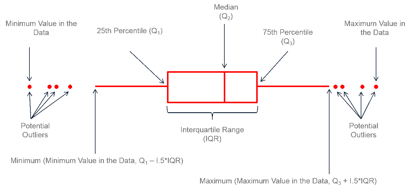
A box plot is a graphical method to summarize a data set by visualizing the minimum value, 25th percentile, median, 75th percentile, the maximum value, and potential outliers. A percentile is the value below which a certain percentage of data fall. For example, if 75% of the observations have values lower than 685 in a data set, then 685 is the 75th percentile of the data. At the 50th percentile, or median, 50% of the values are lower and 50% are higher than that value.
Box Plot Anatomy
 The figure above describes how to read a box plot. Here are a few explanations that may help. The middle part of the plot, or the “interquartile range,” represents the middle quartiles (or the 75th minus the 25th percentile). The line near the middle of the box represents the median (or middle value of the data set). The whiskers on either side of the IQR represent the lowest and highest quartiles of the data. The ends of the whiskers represent the maximum and minimum of the data, and the individual dots beyond the whiskers represent outliers in the data set.
Generate a Box Plot with SigmaXL
Data File: “Box Plot” tab in “Sample Data.xlsx”
Steps to render a box plot with SigmaXL:
- Select the entire range of the data.
- Click SigmaXL -> Graphical Tools -> Boxplots
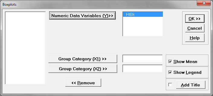
- A new window named “Boxplots” pops up with the selected range appearing in the box under “Please select your data”

- Click “Next>>”
- A new window also named “Boxplots” appears
- Select “HtBk” as the “Numeric Data Variables (Y)”

- Check the check box “Show Legend”
- Click “OK>>”
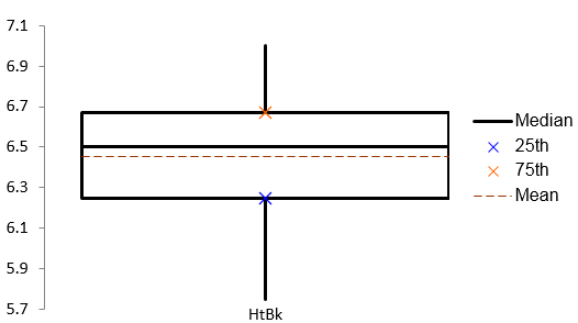
- The Boxplot appears automatically in the new tab “Boxplot (1)”

Model summary: The figure above demonstrates the result of the boxplot after navigating through the SigmaXL menus to yield this output. Notice the interquartile range between the 25th and 75th quartiles, the median line, the mean, and the whiskers.

