Multi Vari Analysis with JMP
What is Multi-Vari Analysis?
Multi vari analysis is a graphic-driven method to analyze the effects of categorical inputs on a continuous output. It studies how the variation in the output changes across different inputs and helps us quantitatively determine the major source of variability in the output. Multi-vari charts are used to visualize the source of variation. They work for both crossed and nested hierarchies.
- Y: continuous variable
- X’s: discrete categorical variables. One X may have multiple levels
Hierarchy
Hierarchy is a structure of objects in which the relationship of objects can be expressed similar to an organization tree. Each object in the hierarchy is described as above, below, or at the same level as another one. If object A is above object B and they are directly connected to each other in the hierarchy tree, A is B’s parent and B is A’s child. In Multi-vari analysis, we use the hierarchy to present the relationship between categorical factors (inputs). Each object in the hierarchy tree indicates a specific level of a factor (input). There are generally two types of hierarchies: crossed and nested.
Use JMP to Perform Multi-Vari Analysis
Case study: ABC Company produces 10 kinds of units with different weights. Operators measure the weights of the units before sending them out to customers. Multiple factors could have an impact on the weight measurements. The ABC Company wants to have a better understanding of the main source of variability existing in the weight measurement. The ABC Company randomly selects three operators (Joe, John, and Jack) each of whom measures the weights of 10 different units. For each unit, there are three items sampled.
Data File: “Multi-Vari.jmp”
Steps in JMP to perform a Multi Vari Analysis:
- Click Analyze -> Variability/Gauge Chart
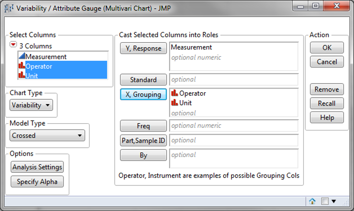
- Select “Measurement” as “Y, Response”
- Select both “Operator” and “Unit” as “X, Grouping”

- Select “Crossed” as “Model Type” since it’s a crossed hierarchy
- Click “OK”
- In the red triangle button next to “Variability Gauge”
- Click “Connect Cell Means” to create lines connecting individual observation
- Click “Show Group Means” to display the average within individual group
- Click “Show Grand Mean” to display the average across all the groups
- Click “Variance Components” to display the proportion table of variance components

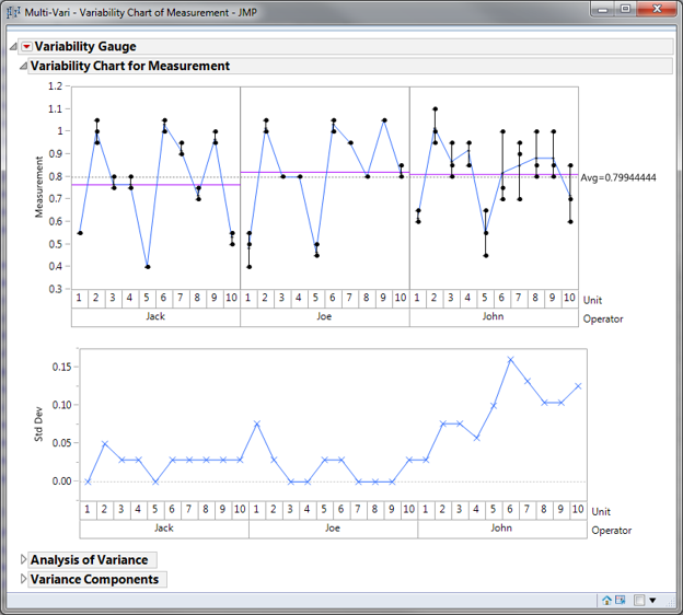
Connecting the cell means enables you to see the variation within and between units, and within operators. When adding the group means you can see the variation between operators as well. The grand mean on the right of the chart provides a broad reference point.
Based on the Multi-Vari chart, the measurement of units range from 0.3 to 1.2. Joe’s and John’s mean measurements stay between 0.8 and 0.9. Jack’s mean is slightly lower than both Joe’s and John’s. John has the worst variation when measuring the same kind of unit because John has the highest difference between the maximum and minimum bars for any kind of unit. By observing the black lines of three operators, it seems like all three operators’ measurements follow the same pattern. The operator-to-operator variability is not large. The unit-to-unit variability is large and it could be the main source of variation in measurements.
Quantifying Variance Components

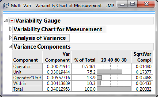
Model summary: JMP can then quantify each component's variance to the system. As you can see from the table above, the unit contributes 75% of the variance.

